
UX case study – RIIPEN Internship at Innovative Landfill solutions
Real-time translation,
real connection
Designed and prototyped the MVP for Lixor Go; a cross-platform app delivering live lecture transcription and translation, built to ensure every student can understand, participate, and succeed regardless of language.
Platform
Mobile & Web
Role
UX Designer
TOOLS
Figma, Figjam, Jira, Slack
สวัสดี
Bonjour
你好
مرحبا
안녕하세요
Hola
Overview
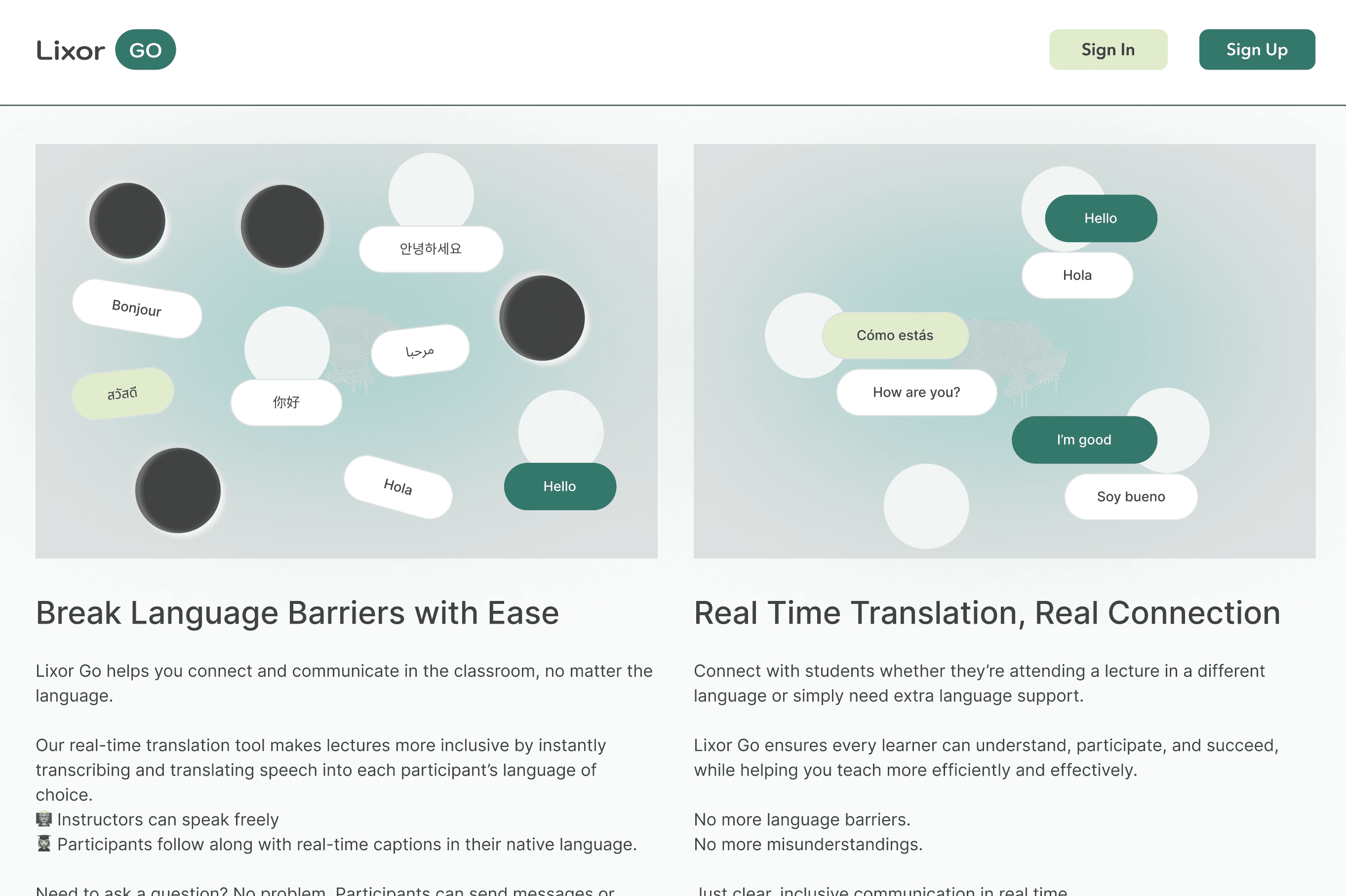
Breaking language barriers in the classroom
Lixor GO addresses a critical accessibility gap in multilingual classrooms. Students attending lectures in a non-native language often struggle to keep pace, miss nuance, and disengage. Lixor GO provides real-time transcription, translation, and question-submission, all within an interface designed to feel calm and focused, not overwhelming.
My role encompassed the full UX process: research synthesis, user flow mapping, component library creation, and high-fidelity prototyping for both a mobile student app and a responsive lecturer web interface.
User Flows
Component Design
Figma Prototyping
Design System Creation
Developer Handoff
WCAG Accessibility
2
Platform Targets
Mobile & Web
4
Core User Flows
Designed end-to-end
∞
Languages Supported
Design system does not limit expansion
1
Unified Design System
Across platforms
tHE cHALLENGE
Supporting all learners & lectures
Multilingual learners face daily comprehension gaps in classrooms missing nuance, falling behind, and disengaging. Lixor Go was designed to close that gap at every stage of a lecture or talk.
The Problem
Language creates exclusion in higher education
Students in a second language can't process complex content in real time, have no channel to ask questions without disrupting class, and lose content the moment a lecture ends.
X
Students can't keep pace with lectures in a second language
X
No low-friction way to ask questions without disrupting class
X
Lecture content is lost — no record to review later
X
Lecturers have no visibility into comprehension gaps
The Solution
Live transcription and translation built for classrooms
Lixor GO transcribes and translates lectures in real time, letting students follow in any language — while lecturers get a web tool to manage multilingual sessions.
✓
Real-time captions in each student's chosen language
✓
Silent question submission without disrupting class flow
✓
Post-session transcript & AI-generated summary download
✓
Lecturer dashboard with session control and participant view
"I would spend a lot of time attempting to translate coure materials to undertand lectures. An app like Lixor Go would help make me feel included and able to participate"
– Interview Participant
Skills Demonstrated
What I brought to this project
Every decision in this project maps to a concrete UX skill. Here's what I exercised — and exactly where you can see it in the work.
Design System
Built a documented, multi-platform system — semantic colour tokens, Avenir type scale, component specs with states, and three-tier spacing tokens for Mobile, Tablet, and Web.
See it: colour palette with pairing tables, button + input + message bubble specs, platform spacing tokens
Cross-Platform UX
Designed separate, platform appropriate experiences for mobile (students) and web (lecturers) — same design system, different interaction patterns, layouts, and information densities.
See it: 4-tab mobile nav vs. top-nav web; sidebar session controls on web; floating panel on mobile
User Flow Design
Mapped end-to-end flows for onboarding, session join, live translation, question submission, and transcript download — across two user types with different goals and contexts.
See it: onboarding carousel → sign-up → home → session join → live view → downloads
Chat Interface Design
Designed a dual-language chat bubble system showing original speech and translation in parallel. Language tags, timestamps, and clear hierarchy aid real-time scanning during a live lecture.
See it: incoming/outgoing bubble variants, language-tag chip system, colour + label redundancy
Accessibility (WCAG)
Applied WCAG AA colour contrast across all pairings. Paired icons with text labels. Designed language tags as redundant non-colour identifiers. Documented a compliance-ready pairing table.
See it: colour pairing table in design system, labelled icon buttons, multi-modal language identification
High-Fidelity Prototyping
Delivered interactive Figma prototypes with component libraries, auto-layout, and real content throughout — structured for a clean developer handoff at MVP stage.
See it: component states documented, spacing values specified, real copy used throughout (not placeholder text)
Design Process
From research to prototype
A structured, iterative process — grounded in real user needs and refined through mentor collaboration at each stage.
1
Discover
Research
2
Define
Strategy
3
Design
Systems + UI
4
Protoype
Handoff
kEY sCREENS
Designed for every moment of learning
Mobile-first for students. Full-featured web for lecturers. One design system underneath both.
Student
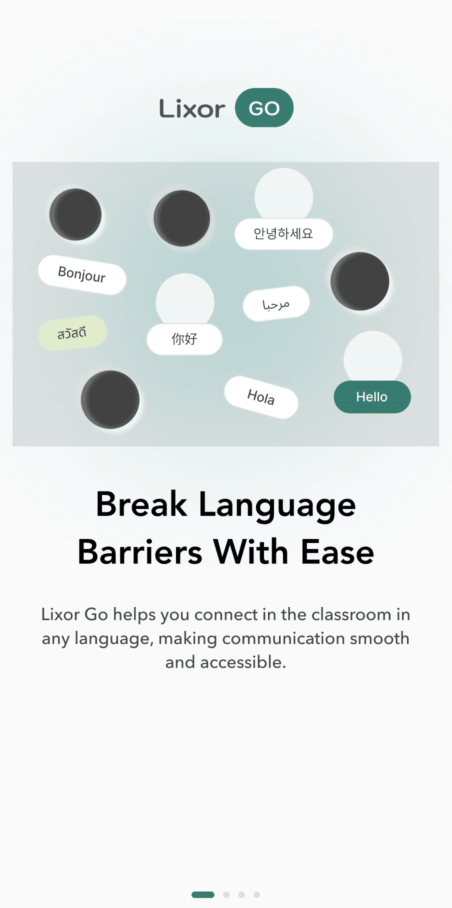
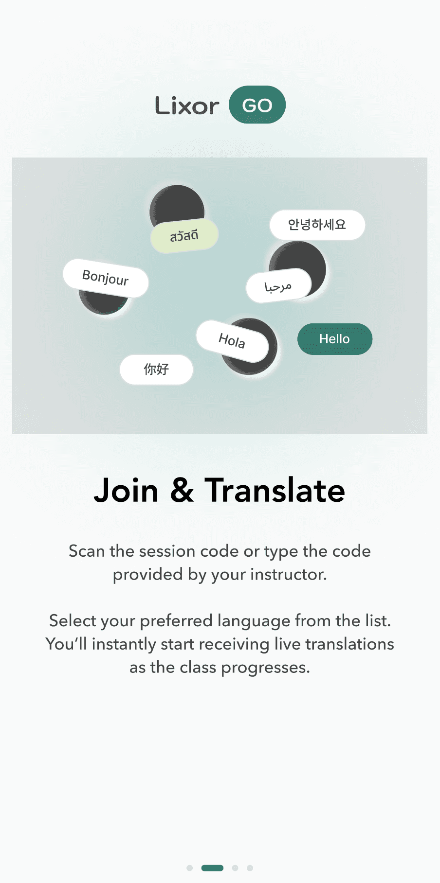
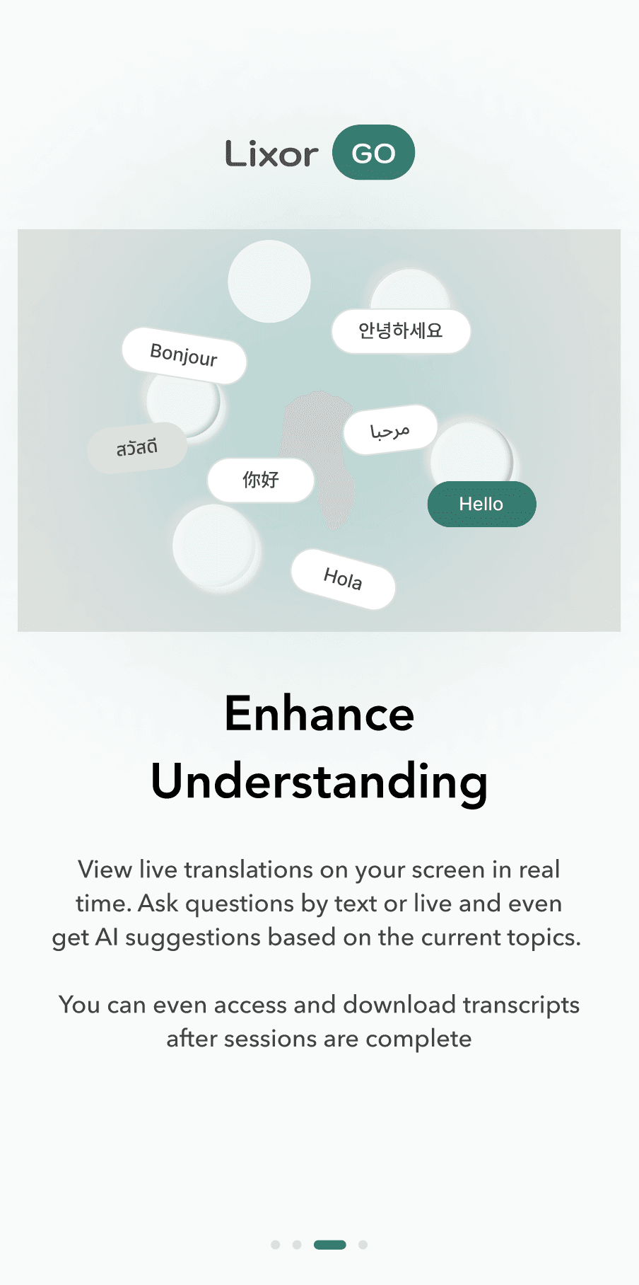
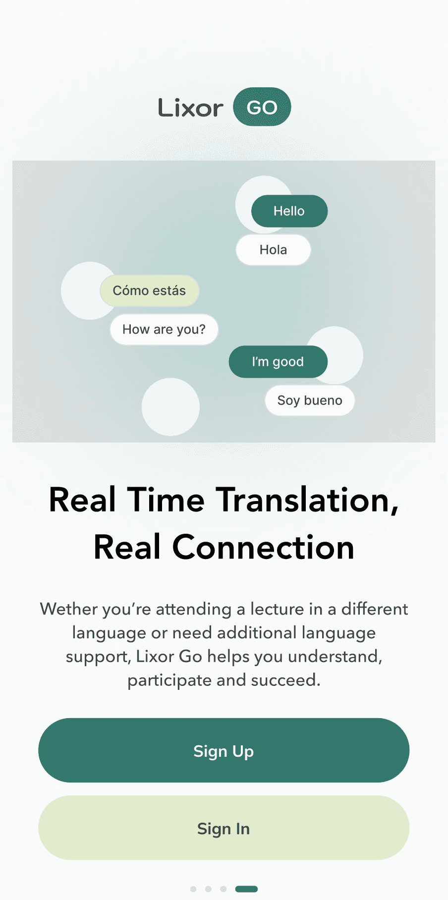
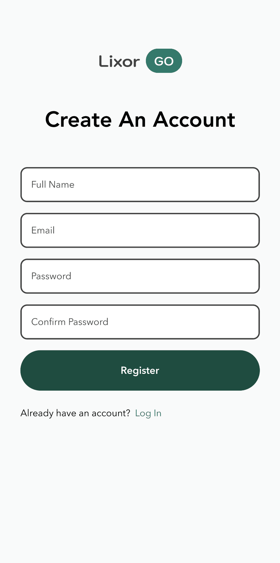
Onboarding Carousel
Four-screen onboarding introduces the value proposition with language-bubble illustrations. Pagination dots indicate progress. The final screen delivers a clear sign-up/sign-in split CTA — minimal friction, maximum clarity.
Onboarding UI
Copy Direction
User Flow
Student
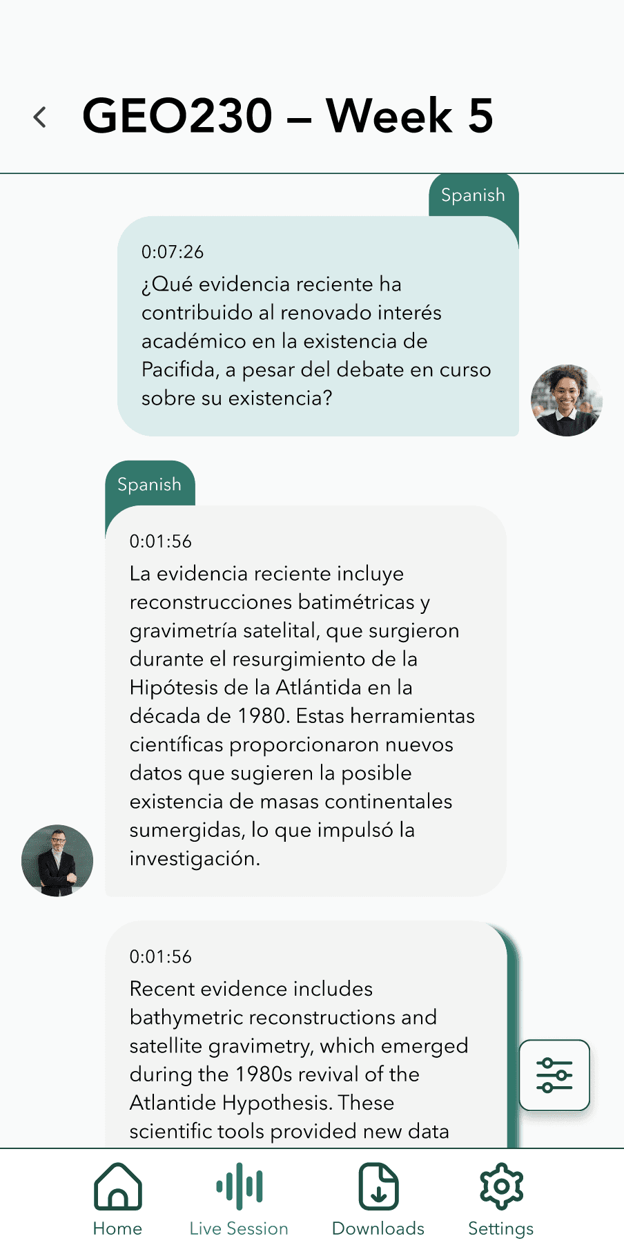
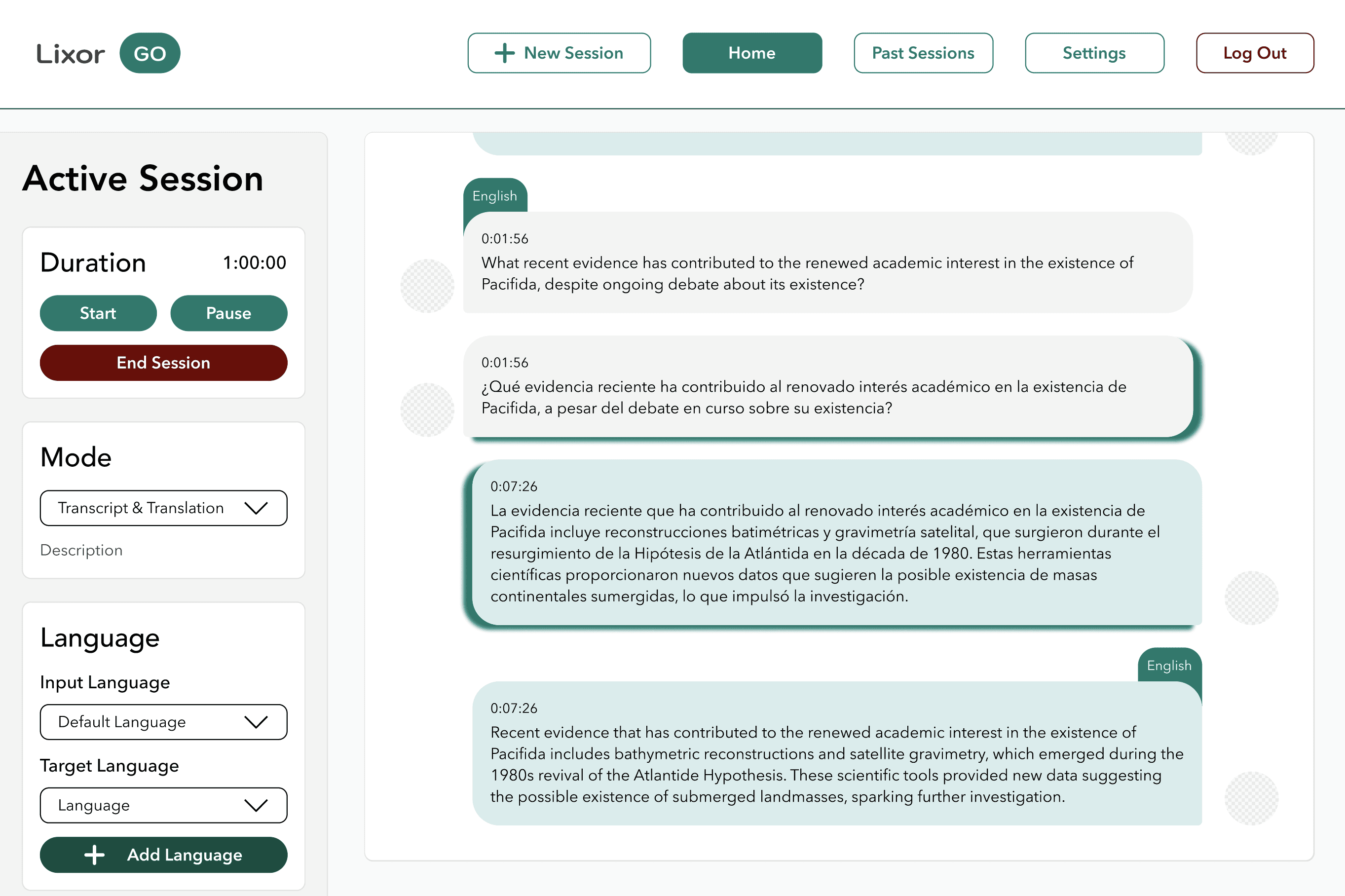
Live Session
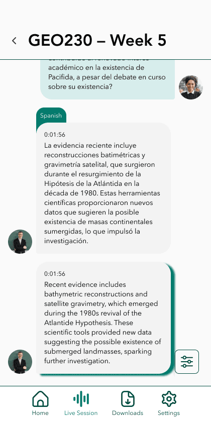
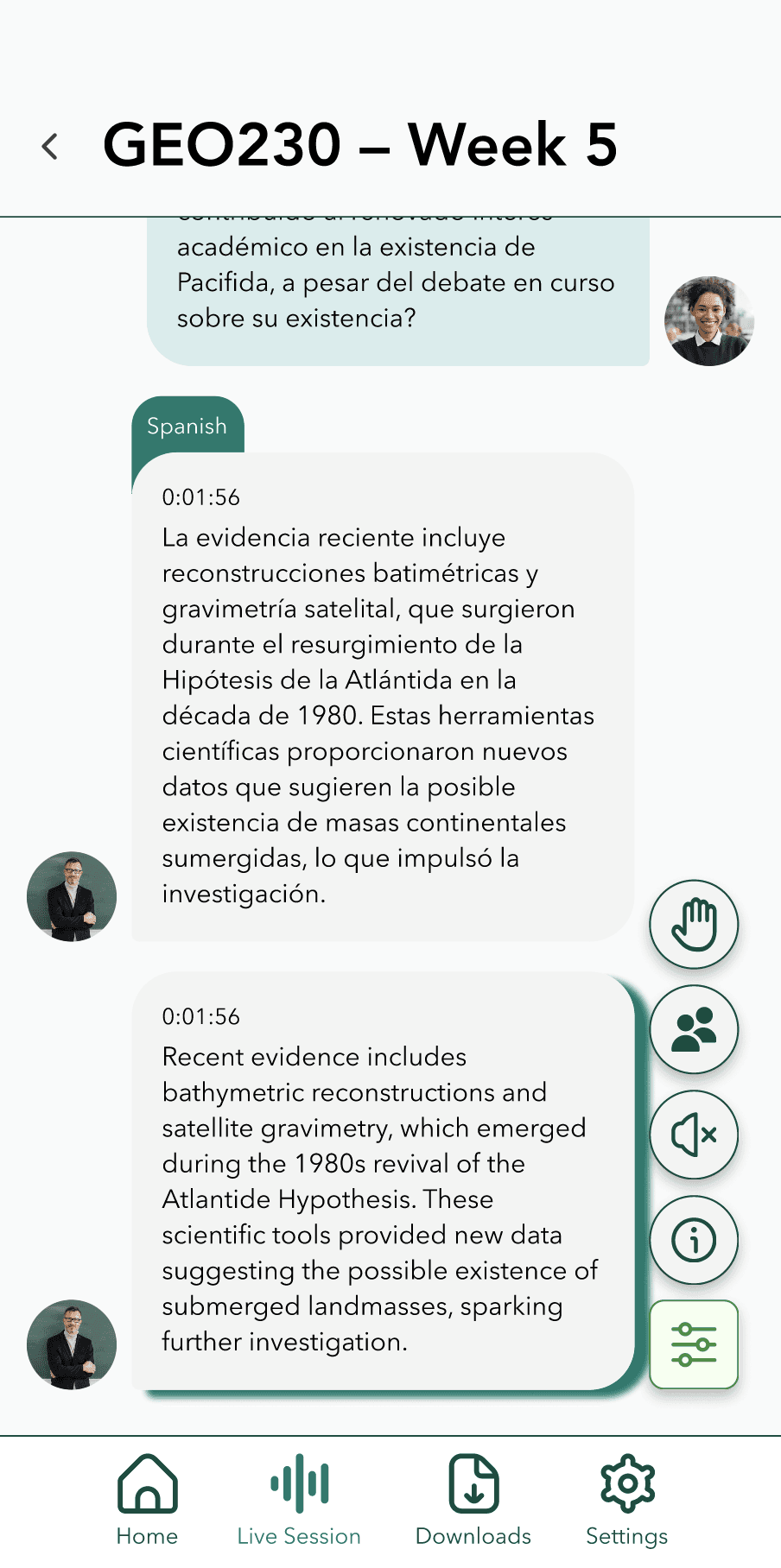
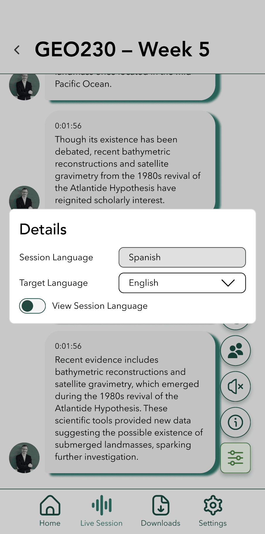
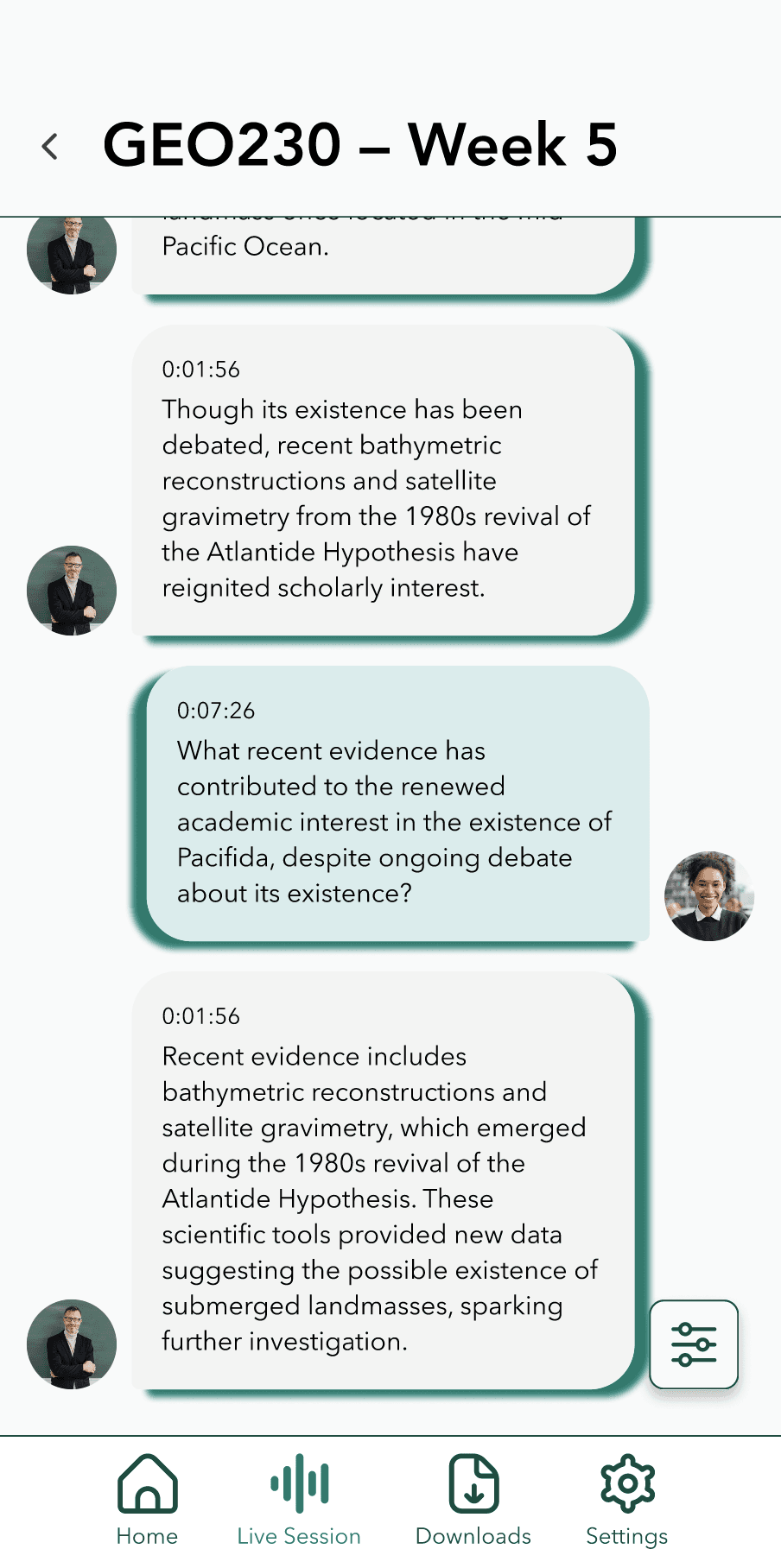
Chat-bubble feed shows original speech and translation in parallel, with language-tag chips and timestamps for rapid scanning mid-lecture. Original language can also be toggled on and off with the ability to change target language in session. A floating settings panel keeps controls such as hand raising, muting & unmuting, participant list and the session code accessible without leaving the content view.
Chat UI
Mobile UX
Accessibility
Student
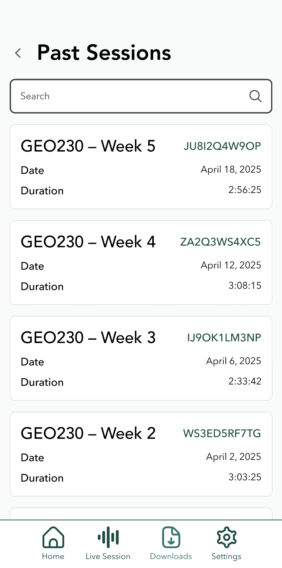
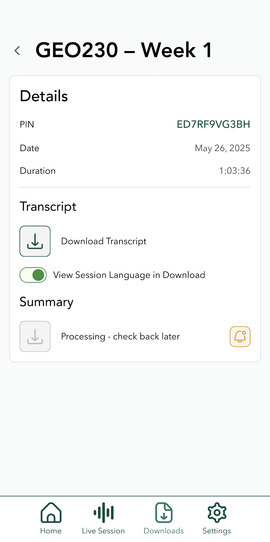
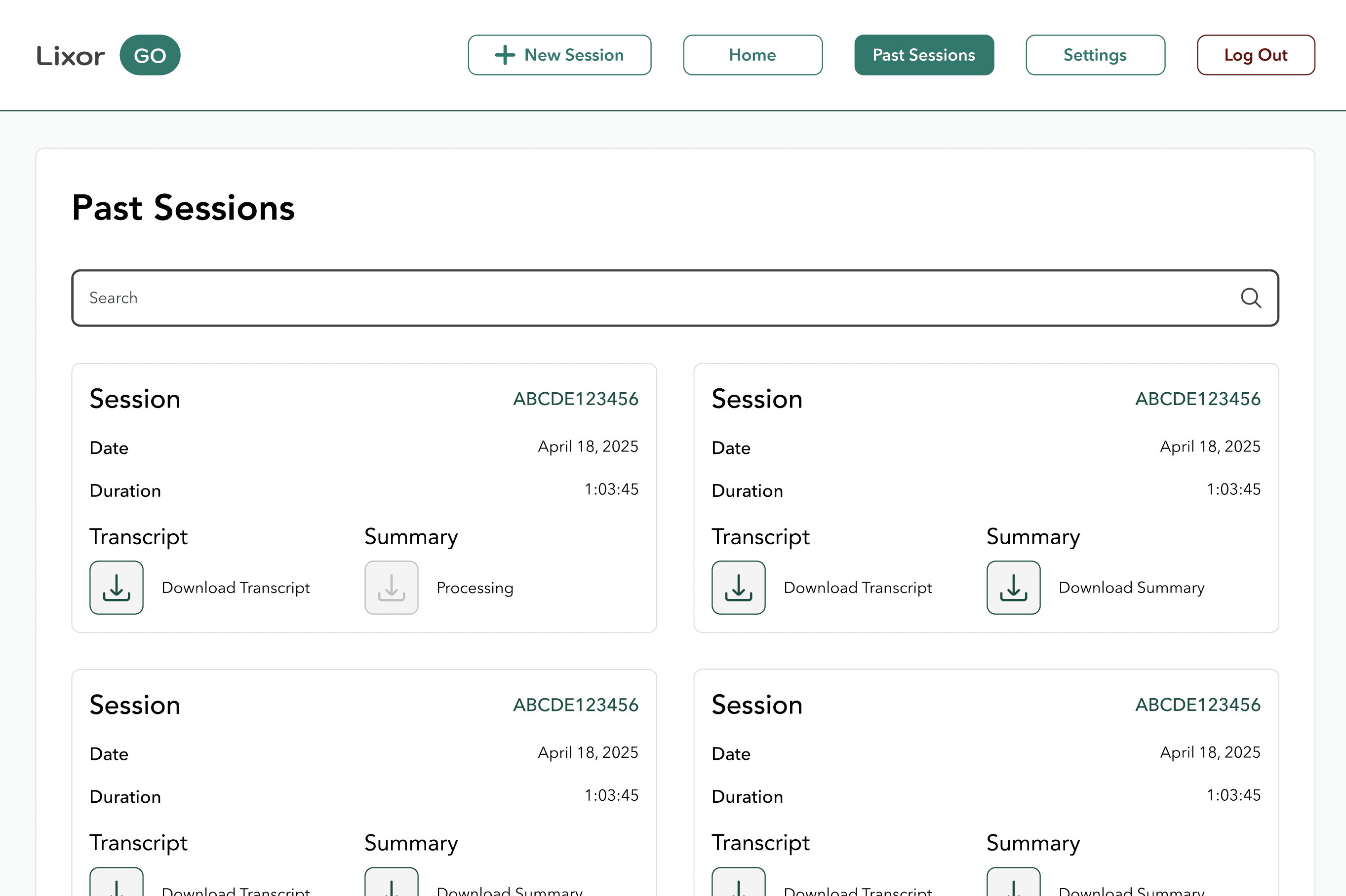
Past Session & Downloads
Searchable list with session PIN, date, and duration. Each entry links to transcript download and AI-generated summary — supporting async review and study after class ends.
Content Strategy
List Patterns
Information Architecture
Student
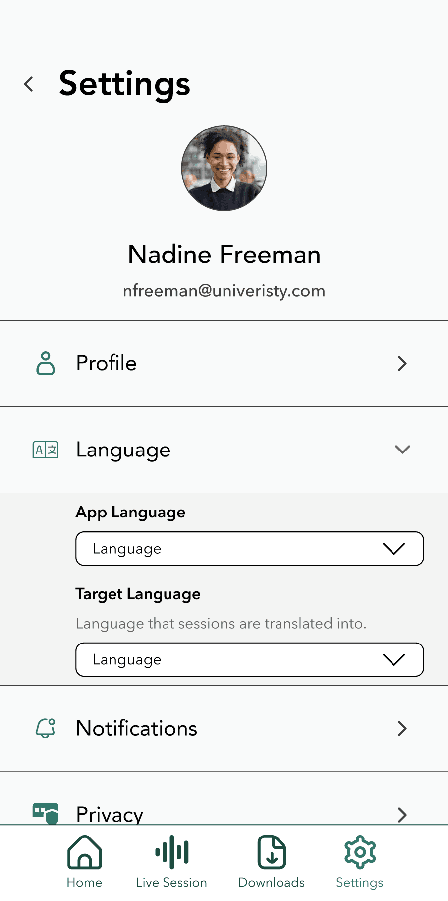
Settings
Profile, language, notifications, and privacy controls use a consistent list-with-chevron pattern familiar from iOS and Android — reducing cognitive load by applying native conventions rather than reinventing them.
Native Patterns
Information Architecture
Component Reuse
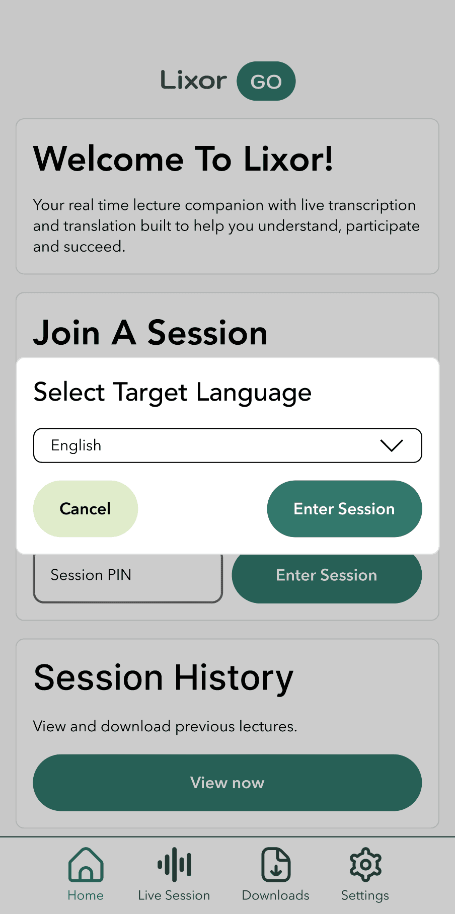
Student
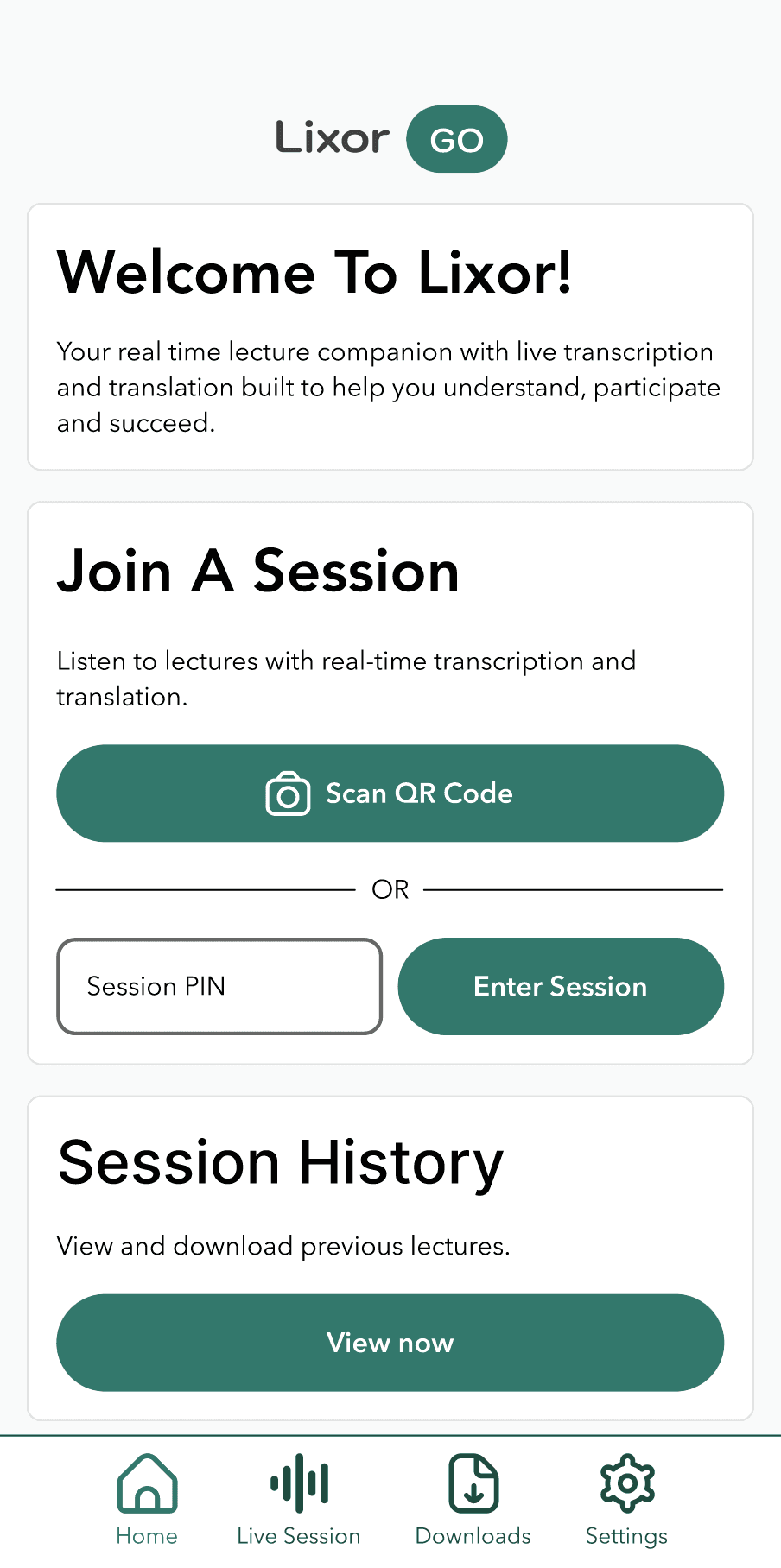
Home Screen
Home screen provides easy access to all app content. The main CTA for mobile users is to join a session this can be done by QR code or by session pin.
Content Strategy
Information Architecture
Ease of Access
Lecturer
Onboarding
The four screen mobile onboarding is converted to a split screen informational onboarding oriented to lecturers.
Onboarding UI
Copy Direction
User Flow
Lecturer
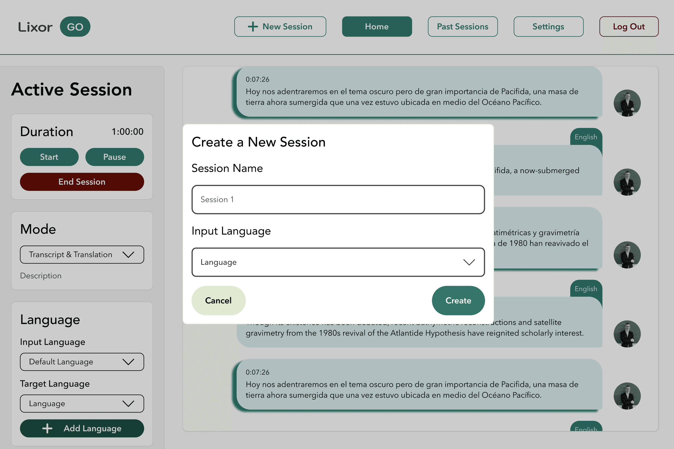
Active Session
Two-panel layout keeps session controls (mode, language config, start/pause/end) persistently accessible in a sidebar while the main feed shows the live multilingual transcript. This layout decision came from recognising that lecturers need to manage session state while watching content simultaneously — two competing needs requiring separate visual zones. Designed for focus and efficiency during live teaching.
Web Layout
Information Architecture
Cross-Platform
Multi-User Context
Lecturer
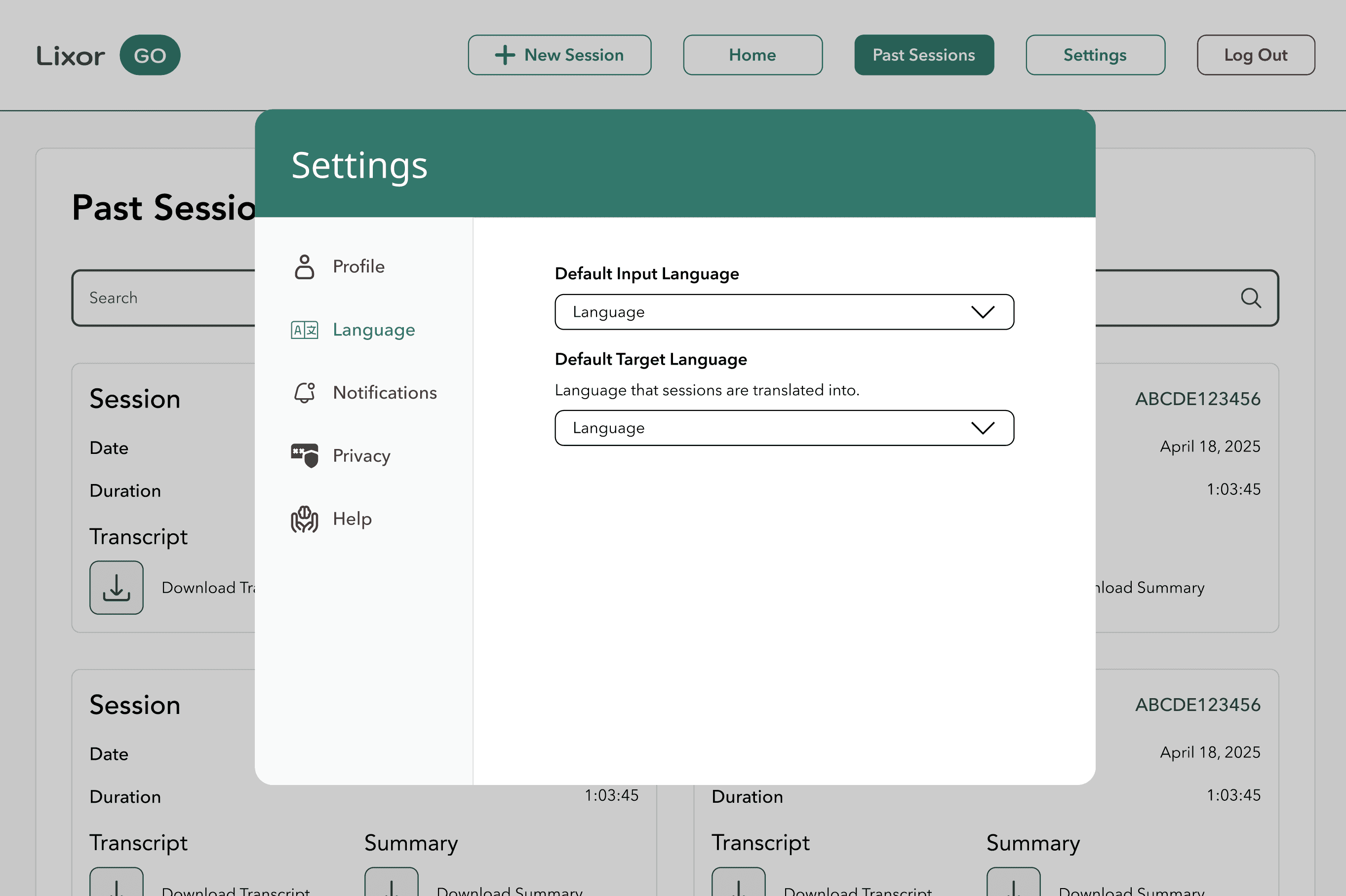
Settings & Past Sessions
Similar to the student platform lecturers have the same settings and control for their session preferences and have full access to transcripts.
User Freedom
Cross-Platform
Research
Design SysetEm
Scalable by design. Intentional by default.
Every colour, typeface, component, and spacing value is documented and purposeful — built to hand off cleanly to developers and extend as the product grows.
Colour Tokens
Hybrid prototype selected for implementation
Version A's Find Your City search interaction combined with Version B's nested FAQ dropdowns. Recommended based on task accuracy and satisfaction data across 11 usability sessions.
Typography
Avenir type system
Logo in Kodchasan. Interface text in Avenir and Avenir Next — Heavy for H1 through Regular for Body Small. Sizes and weights tuned for readability at 12–32px across device types.
H1
Heavy 32px
Button
DemiBold 15px
Body
Regular 14px
H2
Medium 24px
Components
Documented component library
Text fields, dropdowns, message bubbles, small/large buttons, toggles, icon buttons — all with inactive/active/interactive states and exact pixel specs for developer handoff.
Primary
CTA
Outline
Spacing Tokens
Three-tier spacing system
Platform-specific token tables for Mobile (4–148px), Tablet (6–164px), and Web (8–148px). XXS to 7XL ensures consistent rhythm and appropriate density across screen sizes.
XXS
XS
SM
MD
LG
XL
Reflection
What I built. What
I learned. What's next.
The most interesting design problems weren't screens — they were decisions about structure, constraints, and how to serve two very different users with one coherent system.
Key Design Descisions
→
Split the product into a focused mobile app (students) and a power-user web interface (lecturers) — rather than one compromised responsive layout — because their contexts, devices, and interaction patterns are fundamentally different
→
Chose a chat-bubble metaphor for the session feed: familiar, scannable, and naturally suited to conversation across languages with clear speaker attribution
→
Used semantic, named colour tokens so the system scales to new contexts without redesigning — and so engineers can implement predictably
→
Designed the empty-state screen with a brand mascot to turn a potential drop-off moment into a warm, brand-consistent touchpoint
Key Design Descisions
→
Balancing information density in the live session view — too sparse loses context during a fast lecture, too dense is cognitively overwhelming. Solved with tight typographic hierarchy and progressive disclosure
→
Maintaining design consistency across mobile and web while respecting each platform's native patterns and interaction conventions
→
Documenting the design system so a developer picking it up cold could build from it confidently, without needing to ask clarifying questions
→
Collaborating with mentors to validate feasibility of AI-powered features (question suggestions, summaries) and scope them appropriately for MVP