
Bloom & Bean
A research-driven redesign of an e-commerce coffee platform, focused on improving navigation, content organization, and personalization through structured IA, user flows, and usability-tested prototypes.
Contents
Preview

TLDR - Short n' Sweet Version
I redesigned a coffee e-commerce platform to improve navigation and content findability using research-informed information architecture, wireframes, and a dual-path prototype for novice and expert users.
Context
This project was part of a Master’s-level Information Architecture course, aimed at enhancing digital experiences through research and structural design.
The Problem
How do we improve user navigation and content organization for an e-commerce coffee shop platform?
The Challenge
Users were overwhelmed by product listings and lacked filtering options that reflected how they naturally categorized coffee.
The Solution
A redesigned architecture and prototype featuring robust filters and a personalized quiz to support both novice and experienced coffee buyers.
Research Methods
Used competitor analysis, open card sorting, and user interviews to understand user needs and mental models.
Problem Statement
Users need intuitive, guided navigation to discover coffee products that match their tastes without cognitive overload.
Secondary Research
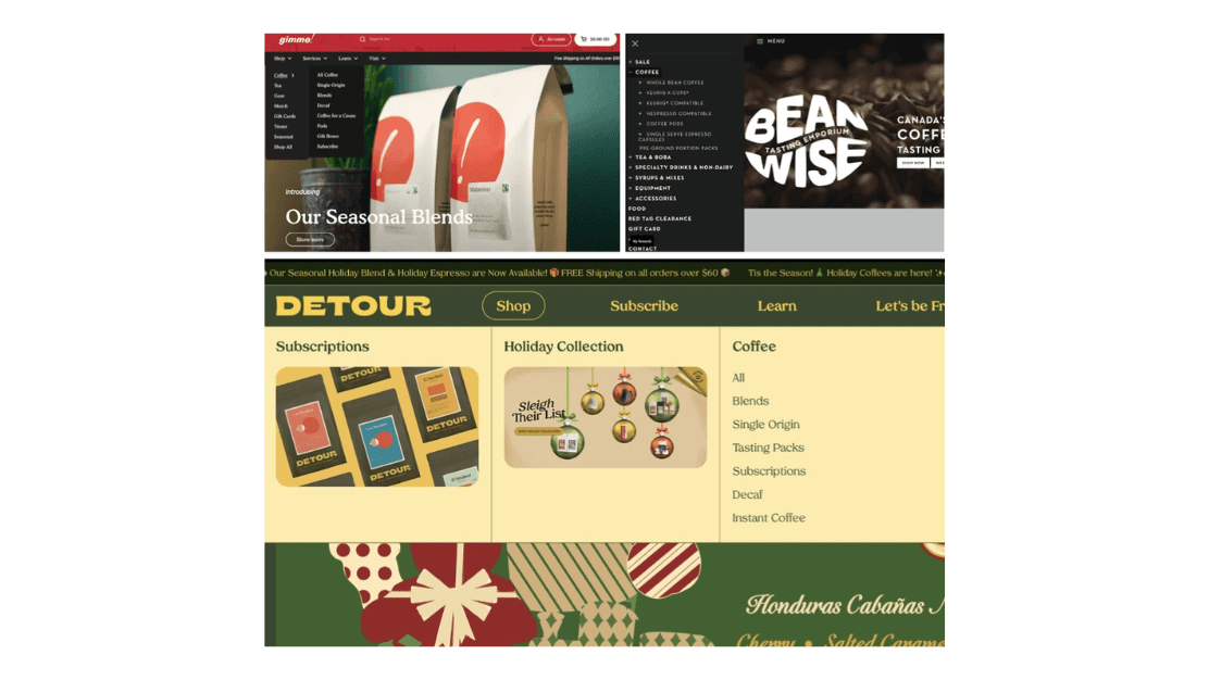
Reviewed IA best practices and analyzed features across coffee e-commerce sites like GimmeCoffee and BeanWise.
Context & Struggles
Users struggled with flat site hierarchies, unclear labels, and lack of contextual filters.
Primary Research
7-participant open card sort to observe mental groupings of coffee attributes.
Key Interview Findings
Users tied origin to taste, Novices preferred guidance & Enthusiasts wanted filtering control.
User Personas
The Coffee Enthusiast: Seeks detailed filters for exploring. The Novice Explorer: Prefers guided product discovery via quiz.

Competitor Analysis
Evaluated IA and filtering across 4 major platforms.
Design Decisions

Guided IA principles and user mental models informed clear content hierarchy and navigation flows.
Site structure schematic
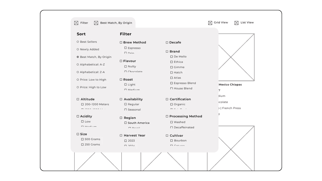
Created a filter-driven product page for expert users, allowing granular control via sidebar filters.

Filter Wireframe
Developed an interactive quiz to help new users find coffee suited to their preferences.

Usability Testing
Tested both prototypes with 5 users to assess flow, clarity, and filtering logic.
Filters
Participants found filters intuitive and appreciated dual view (list/grid) toggle.
Engagement
Quiz flow was described as “engaging,” “easy to follow,” and reduced decision fatigue.
Key Findings
Users successfully located products faster and with more confidence. Minor updates were made to quiz question phrasing and filter label clarity.
Final Design
Two complementary experiences tailored for both novice and advanced coffee users.
Filtering Options
“View All” filter page with dual viewing options
Progressive Disclosure
“Coffee Guide” quiz with progressive disclosure
Takeaways
Importance of Research
Research-driven IA empowers user-friendly, intuitive navigation.
Duality
Designing dual-path experiences increases product findability for a range of user types.
Cognitive Ease
Visual clarity and cognitive ease are essential to e-commerce satisfaction.